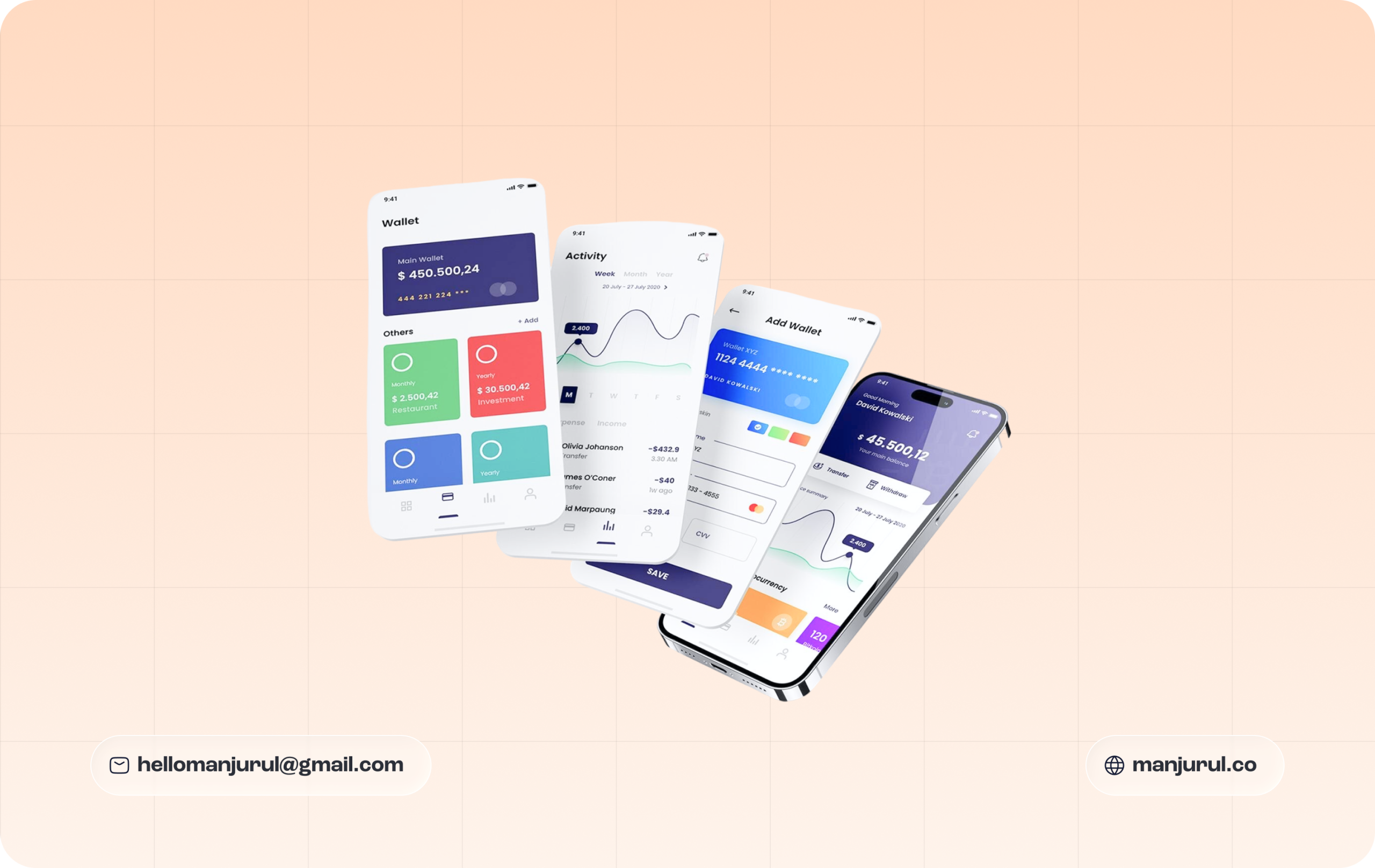
A few years ago, whenever I started a new design project, my instinct was to open Figma and create a desktop frame first. It felt natural. Large canvas, plenty of space, and the freedom to place content wherever I wanted. Once the desktop version looked polished, I would move to tablet and mobile screens.
At first, this approach seemed efficient. But after working on more SaaS products, startup MVPs, and digital platforms, I noticed a recurring problem. The mobile version often felt like a compressed copy of the desktop experience rather than a thoughtfully designed product.
That realization completely changed the way I approach design. Today, I start almost every project with a mobile-first mindset.
Mobile-first design is a design strategy where the product experience is created for mobile devices before expanding to larger screens such as tablets and desktops. Instead of designing a complex desktop interface and trying to squeeze it into a smaller screen, mobile-first design forces us to focus on what truly matters.
Limited screen space encourages better prioritization, clearer content hierarchy, and more intentional user experiences. It is not simply about designing for smartphones. It is about identifying the most important user actions and building around them from the beginning.
The way people interact with digital products has changed dramatically. For many businesses, mobile devices generate the majority of their traffic. Whether users are browsing a website, managing tasks, shopping online, orusing a SaaS platform, their first interaction often happens on a mobile device.
This shift creates an important challenge for designers. If the mobile experience fails, the entire product experience fails. Designing mobile-first helps solve this problem by ensuring that essential content and functionality remain accessible regardless of screen size.
One of the biggest advantages of mobile-first design is that it eliminates unnecessary complexity. When designing a dashboard on a desktop, it is easy to add multiple widgets, sidebars, charts, and navigation layers. But when working within a mobile screen, every element must justify its existence.
Questions naturally emerge:
These constraints often lead to cleaner and more focused solutions. As designers, limitations can be surprisingly beneficial. They help us create experiences that prioritize clarity over decoration.
Many people assume mobile-first design only benefits mobile users. In reality, it improves the experience across every device. When the core user journey works perfectly on a small screen, expanding it for tablets and desktops becomes much easier. Larger screens provide additional opportunities for enhancement, but the foundation remains solid.
This process follows a principle known as progressive enhancement. Rather than starting with a complex experience and removing features for smaller screens, we start with the essentials and gradually enhance the experience as more screen space becomes available. The result is a more scalable and consistent product.
As a product designer, I view mobile-first design as more than a responsive design technique. It is a product thinking exercise. Before opening a design tool, I spend time understanding:
Mobile-first design naturally aligns with these considerations because it forces teams to focus on solving real user problems before adding visual complexity. In many ways, it acts as a filter that removes distractions and highlights what truly creates value.
My process usually follows these steps:
Mobile-first design is not about making smaller screens the priority. It is about creating better products. Starting with mobile forces us to focus on simplicity, clarity, and user needs before introducing additional layers of complexity. It helps create experiences that are more accessible, more scalable, and ultimately more effective.
For modern websites, SaaS products, and digital platforms, mobile-first design is no longer optional. It has become a fundamental part of building products that work in the real world. The next time you begin a design project, try starting with the smallest screen first. You may discover that designing with constraints leads to stronger decisions, cleaner interfaces, and a much better experience for everyone.
Helping founders and teams create clear, usable experiences with systems built for long-term growth.

Before we jump into design, These FAQs will give you a behind-the-scenes look at my process, workflow, and what collaboration with me actually feels like.
Every project starts with understanding your goals. I take time to learn about your product, users, and vision then translate that into a design strategy that connects creativity with business growth.
Absolutely. Many founders come with a concept, not a clear structure — I help refine that idea, define user journeys, and turn it into a product-ready direction.
I design SaaS platforms, web apps, mobile apps, and landing pages — anything that helps startups grow and scale through thoughtful, system-driven design.
Typically, I deliver MVP designs within 7–10 days, depending on complexity.
Each design is fast, focused, and built with scalability in mind.
Always. Your idea, assets, and product details stay completely private. I take confidentiality seriously in every project I work on.